The Modern, User Centric App for LA Fitness Members of All Ages
Overview
I started this project on my own time after being an employee of an LA Fitness gym. I noticed that both members and employees were often puzzled by the simplest tasks on the gym's app, tasks that were much easier on other apps. Standing at the front desk, I observed which features and aspects of the experience resonated positively with users, as well as their pain points or frustrations. I would sketch out ideas for improvements using insight I gained after helping a confused member. So, I decided to apply what I had learned so far in my masters program and put myself to the test by reimagining a modern and more user friendly LA Fitness app.
Role
Product Strategy Brand Research UI Design User Reports UX Design
Tools
Figma Photoshop
Challenges
& Solutions
01
Navigation / Complexity / Interface Clutter / Membership Management
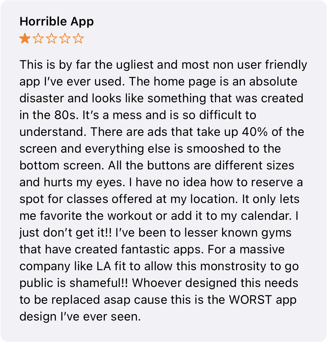
The challenges within the LA Fitness gym app redesign revolve around several critical pain points affecting user experience. Firstly, the app's navigation structure poses a significant hurdle, characterized by complexity and disorganization. Users encounter difficulties in swiftly finding essential features like account management, class scheduling, and membership code access due to this convoluted navigation system. Secondly, the app suffers from a cluttered interface inundated with excessive information, leading to confusion and hindering users from promptly locating crucial functionalities. Lastly, the app's current design fails to facilitate efficient membership management, making it arduous for users to handle their memberships, update account details, comprehend benefits, or access necessary information expediently. These challenges collectively contribute to a frustrating user experience, impeding members' ability to manage their gym activities smoothly.
Simplify / Organize / Optimize
To significantly enhance the LA Fitness app, implementing intuitive changes is imperative. Simplifying the account setup involves streamlining the process to match the user-friendly experiences seen in other successful apps, reducing complexities and eliminating unnecessary steps. By decluttering the homepage, the redesign aims to create a more organized and visually appealing interface, allowing users to navigate effortlessly to desired sections such as class schedules, membership details, and account settings. The addition of a search feature within the class scheduling page will revolutionize user convenience, enabling quick access to specific classes based on type, instructor, or timing preferences. Moreover, optimizing the QR code check-in function will ensure a smoother and more accessible process, enabling users to swiftly gain entry to the gym, enhancing their overall experience with efficiency and ease.
Goals
02
Simplicity: Focus on a clean and intuitive design to make the app easy to navigate and use. Reduce complexity by prioritizing essential features and decluttering the interface to enhance user understanding and interaction.
Consistency: Ensure uniformity in design elements, typography, colors, and user interface components throughout the app. Consistency helps in establishing familiarity and aids users in predicting the app's behavior, creating a cohesive user experience.
Accessibility: Design with inclusivity in mind, ensuring that the app is usable by individuals of diverse abilities. Implement features like adjustable text sizes, high contrast options, and intuitive navigation to cater to a wider user base.
Engagement: Foster user engagement by incorporating interactive elements, personalized experiences, and features that encourage regular interaction with the app. Utilize notifications, gamification, and social/community aspects to keep users engaged and motivated to achieve their fitness goals.
03
Research
Brand Research
LA Fitness, as a premier fitness center, embodies a holistic approach to health and wellness, offering a diverse range of facilities, classes, and services to its members. Representing LA Fitness within the app requires capturing its essence as a comprehensive fitness destination. This representation should emphasize accessibility to a myriad of amenities, including state-of-the-art equipment, various workout programs, and expert-led classes spanning yoga, cycling, strength training, and more. Integrating features that reflect the gym's expansive offerings, such as personalized fitness plans, nutritional guidance, and wellness resources, will resonate with users seeking a well-rounded fitness experience. Additionally, highlighting community engagement, social events, and member benefits will foster a sense of belonging and encourage active participation, aligning with LA Fitness's commitment to supporting members in their fitness journeys.
Target Audience
The target audience for this app is new and current members. Based on the research I conducted while working at LA Fitness the users will range from as young as 12, to seniors who may not be as technically savvy. They can be divided into 3 groups
1. Individuals who are in good physical shape and have experience with exercises
2. People beginning their fitness journey and want to improve their physical appearance or start practicing a healthier lifestyle
3. Recreation focused seniors who want to go to destress and enjoy the amenities
Quick Finding Reports
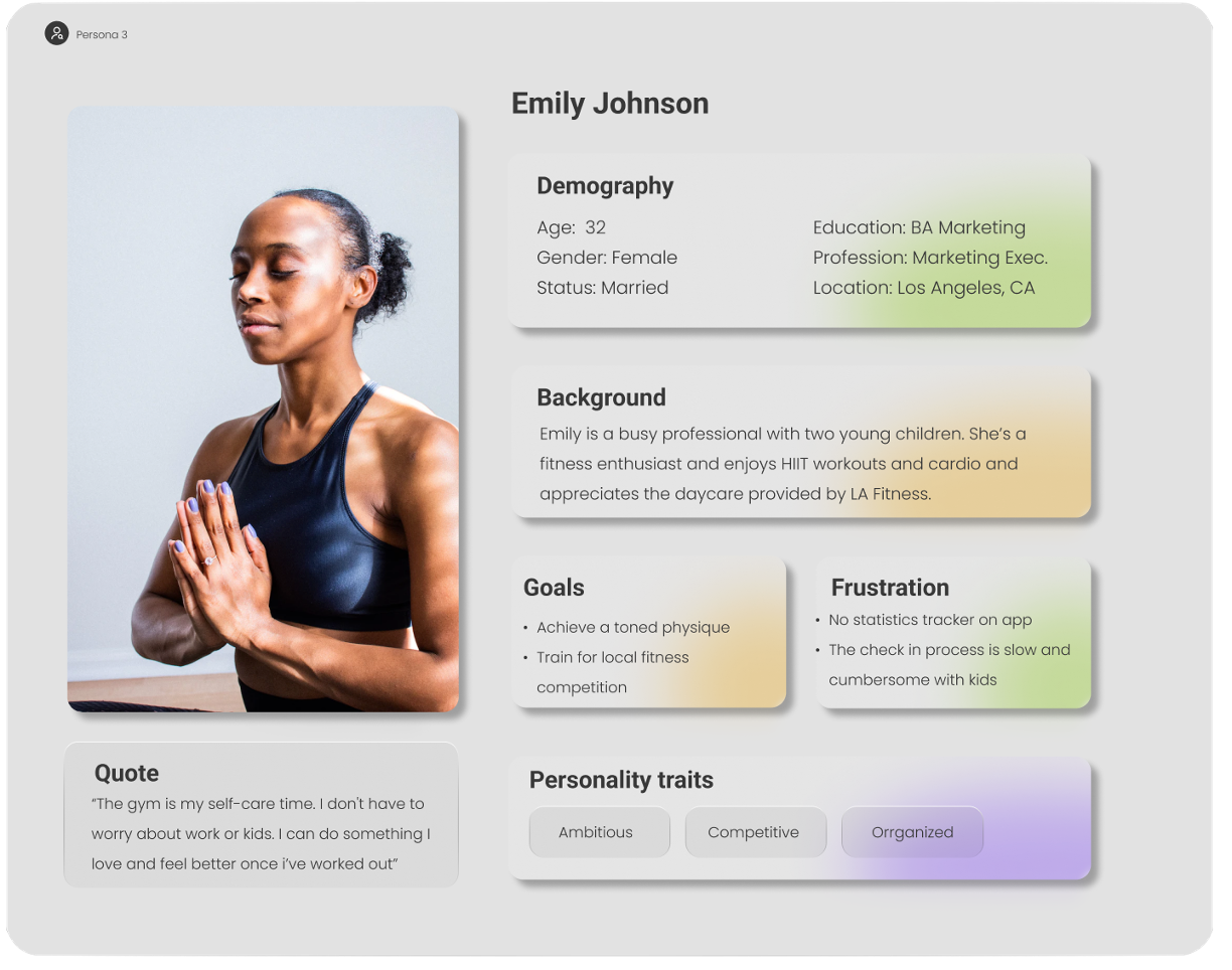
Personas
04
05
Prototype
Original Design vs First Iteration
Original Design
After
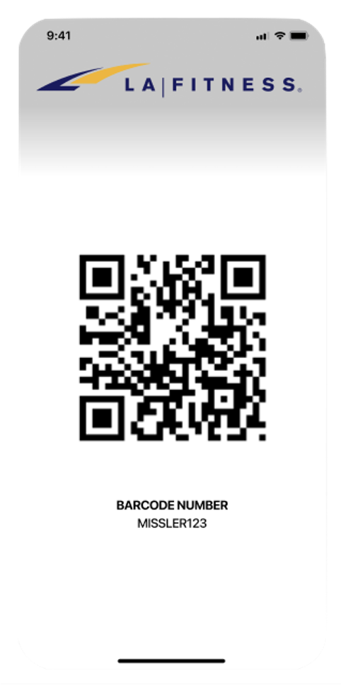
QR code is small and hard to scan
Profile picture is unnecessary and oftentimes outdated by years so members no longer resemble their photo
No barcode present as second form of ID
Original Design
Large QR code
Unnecessary photo removed
No username present as second form of ID
Barcode present
After
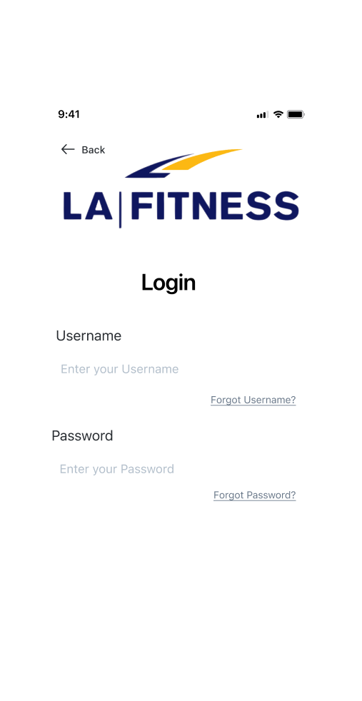
Modern IOS look
More user friendly step by step design
multiple set up options “forgot option
Original Design
After
Too much scrolling required
Populates classes in multiple gym locations
Filter options limited
Search bar
Multiple search options
more information per page
Linear structure for easy scanning
Structured in order of importance
Navigation bar
No rational visual hierarchy
Takes too long to scan
Too many options
Original Design
After
Sign-in Page
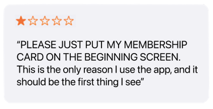
“Scan QR” is the most used feature and its the first thing a user sees
Login and sign-up options are easily available and visual hierarchy is used appropriately
Sign-in Page
Clean look
included back button
Final
Prototype
06
Multiple sign-up options
Sign-up Page
Homepage
Calendar that can track and indicate gym visits and class bookings
Quick link to schedule a class
Visuals with upcoming classes
Friend activity/social communication for gym buddies
Ability to display biometric statistics linked to apple health
Badges to increase gamification and encourage return visits
Separate what’s new/ads rom LA Fitness
Comprehensive navigation bar
Class Schedule Page
Easy schedule options
Multiple filter options
Class and instructor visible
Empty state and solid state
Classes are at specific location or”home gym”
Your Classes
indicates the day with solid state
Detailed class info
Detailed instructor info
Previous class stats


